While we make the lights, designers like Mel share the tips…
The bedroom is a room to relax and wind down after a busy day, so it’s vital you get this one right. We wanted to know what makes the perfect bedroom in Mel’s eyes.
Mel was our first ever Instagram collaboration, we spotted her account @banish_the_beige_ and knew she was the perfect fit! Her feed was bright and colourful, but her personality and stories were the big seller, showing her followers how to create a fabulous home that ‘ordinary’ people can achieve. By day Mel is a Physiotherapist but by night her and her partner have been renovating a 1890’s Victorian terraced house in Chester, creating those real #goals.
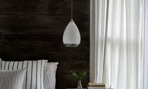
We got some ideas together and provided two bespoke bedside lights for Mel’s soon to be bedroom transformation. The Mixture of Ribbed glass, texture, pattern and faux greenery created a very popular Instagram interior.
Here’s what Mel had to say to about creating that “dreamy bedroom look”
The very first thing I do when creating a space is to scour design pages, interior magazines, online stores & my fave Instagram accounts.
Secondly I draw the space on paper so I can really get an idea of size regarding furniture, lighting & storage. I then create a moodboard (this is really important so you can see how the colours will work together).
With our bedroom I wanted to create a tranquil space, somewhere to relax but also somewhere that aids you in getting up in the morning, therefore, I wanted it to be fairly bright.
I started with the wall colour, one of my tips is to paint the ceiling in the same colour as the walls or a similar hue. This blurs the lines between walls and ceiling and makes the room feel bigger. I also painted the woodwork and the radiator in the same shade, I went with Little Greene’s light peachblossom.
With having one colour on all the walls etc this then gives more scope for textures and accessories, it makes it easier to change this up, I started with a contrasting teal but now have a more subdued pallet just by changing accessories.
The lighting had to be Fritz Fryer! We worked together to create the look, I wanted something simple yet elegant and with their bespoke range you can tailor it to fit seamlessly into the room.
I use layered throws and cushions in odd numbers to add texture and pattern. I also used faux greenery in the wall planters and on bedside tables to give it a botanical feel which runs throughout my home.
We loved the collaboration just as much as the end result. Using a simple bracket and what is essentially a pendant light with a plug on the end is a simple idea but styled correctly, the overall look is a considered and effective one.

